Svelte Challenge: Part II
An ugly (but responsive!) scatter plot

An ugly (but responsive!) scatter plot

Can I learn interactive data viz in two months?

Mapping America’s diversity using ACS data

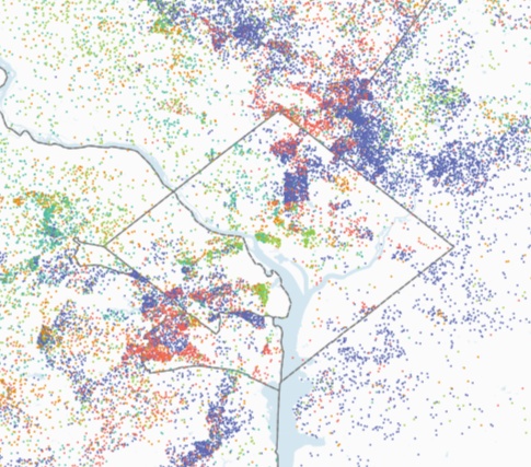
Mapping immigrant communities with ACS data, R, and QGIS.

1 in 4 residents of the greather Washington, DC region were born in a foreign country. I use census data to map the top five foreign-born communities in the region.